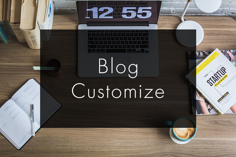
はてなブログの見出しを変更したい!という方のために、今回はたくさんの見出しを作ってみました。
コピペだけで、はてなブログの見出しがカスタマイズできます。
デザインは選べる20種類!
※使っているテーマによっては、うまくいかない可能性があります。ご了承ください。
見出しのカスタマイズ方法
後ほど紹介するコードは、デザインページ下(デザイン→カスタマイズ→デザインCSS)にコピペすれば、CSSが反映されます。元々あるコードの下にコピペしてください。
カスタマイズ方法を紹介する前に、先にコードの見方だけ説明しておきます。
はてなの編集画面では、見出しのタグは以下のように設定されています。
大見出し ・・・ h3
中見出し ・・・ h4
小見出し ・・・ h5
中見出しの見出しを変えたいときはコード内の h3 → h4 に書き換えて下さい。小見出しを変更したい場合は h3 → h5 に書き換えて下さい。
見出しの背景、ライン、文字の色はご自身で好きな色に変更してください。
たとえば、background-color: #111;の下線部が背景色です。ここのカラーコードを書き換えると色が変わります。
同様に、color: #111;の下線部が文字の色です。
border: #111;の下線部がラインの色です。
下記のサイトからカラーコードが確認できます。コードをコピペして書き換えれば好きな色に変更できます。
もし使っているテーマの見出しデザインと重なってしまったら、下のコードを先に記述して、その後に見出しのコードを追加してください。
.entry-content h3,
.entry-content h3::before,
.entry-content h3::after {
  background: none;
  border: none;
  border-radius: 0;
}
スマホの見出し変更方法
スマホとPCのデザインを別にしている場合は、以下のようにデザインを設定してください。
スマホの見出しを変えたい場合は、デザイン→スマートフォン→記事上にコピペしてください。その場合、<style>タグを記述して、その中にコードをコピペしてください。
<style>
/*ここにコードをコピペしてください。*/
</style>
これでスマホの見出しも変更できます。
見出しのデザイン一覧
それでは、見出しのデザインを20種類紹介していきます。
背景カラー
背景に色をつけただけのシンプルなデザインです。
.entry-content h3 {
  padding: 4px 8px;
  color: #333;
  line-height: 1.5;
  background-color: #d9f7f5;
}
左に縦ライン
左に縦ラインを入れたデザインです。
.entry-content h3 {
  border-left: 6px solid #333;
  padding-left: 8px;
  position: relative;
  color: #333;
  line-height: 1.5;
}
左にライン、グレー背景
左にカラーのラインが入ったシンプルな見出しです。よく見かける見出しのデザインですね。
.entry-content h3 {
  padding: 6px 10px;
  border-left: 8px solid #29b6b7;
  color: #333;
  line-height: 1.5;
  background-color: #f5f5f5;
}
左と下にライン、グレー背景
左に太めのライン、下に細めのラインが入った見出し。こちらもよく見かける見出しのデザインですね。
.entry-content h3 {
  padding: 6px 10px;
  border-left: 8px solid #29b6b7;
  border-bottom: 1px solid #29b6b7;
  color: #333;
  line-height: 1.5;
  background-color: #f5f5f5;
}
上下にライン
上下にラインが入った見出し。
.entry-content h3 {
  padding: 6px 0;
  border-top: 2px solid #2d70a4;
  border-bottom: 2px solid #2d70a4;
  color: #2d70a4;
  line-height: 1.5;
}
2色のライン
見出しの下に2色のラインを重ねるデザイン。
.entry-content h3 {
  padding: 6px 0;
  border-bottom: 4px solid #ccc;
  color: #333;
  line-height: 1.5;
  position: relative;
}
.entry-content h3:before {
  content: '';
  position: absolute;
  top: 100%;
  left: 0;
  width: 100px;
  height: 4px;
  background-color: #3498db;
  z-index: 2;
}
デニム生地風
ネイビーの背景色で、デニム生地風に。
.entry-content h3 {
  position: relative;
  padding: 10px 10px;
  color: #fff;
  line-height: 1.5;
  background-color: #293b6a;
  border-radius: 4px;
}
.entry-content h3::before,
.entry-content h3::after {
  position: absolute;
  width: 100%;
  height: 4px;
  z-index: 2;
  content: '';
}
.entry-content h3::before {
  top: 0;
  left: 0;
  border-bottom: 1px dashed #fff;
}
.entry-content h3::after {
  bottom: 0;
  left: 0;
  border-top: 1px dashed #fff;
}
吹き出し風
吹き出し風のデザイン。
.entry-content h3 {
  position: relative;
  padding: 8px 12px;
  color: #fff;
  line-height: 1.5;
  background-color: #29cec5;
  border-radius: 4px;
}
.entry-content h3::before{
  content: '';
  position: absolute;
  top: 100%;
  left: 28px;
  width: 0;
  height: 0;
  border: 10px solid transparent;
  border-top-color: #29cec5;
}
2色の背景を重ねた
二枚の四角の背景を重ねてみました。色の組み合わせが楽しめる見出しです。
.entry-content h3 {
  position: relative;
  padding: 6px 10px;
  color: #fff;
  line-height: 1.5;
  z-index: 2;
}
.entry-content h3::before,
.entry-content h3::after {
  content: '';
  position: absolute;
  width: calc(100% - 4px);
  height: 100%;
}
.entry-content h3::before{
  top: 0px;
  left: 0px;
  z-index: -1;
  background-color: #29cec5;
}
.entry-content h3::after{
  top: 4px;
  left: 4px;
  z-index: -2;
  background-color: #333;
}
枠線と黒い影
枠線に黒の影が入ったデザインです。
.entry-content h3 {
  position: relative;
  margin-right: 4px;
  padding: 8px 10px;
  border: 1px solid #222;
  color: #333;
  line-height: 1.5;
  z-index: 2;
  box-shadow: 4px 4px #222;
}
可愛い四角
可愛い感じの見出し。たまに見かけるデザインですね。
.entry-content h3 {
  position: relative;
  padding: 6px 0 6px 34px;
  border-bottom: 2px solid #ce0d55;
  color: #333;
  line-height: 1.5;
}
.entry-content h3::before,
.entry-content h3::after {
  content: '';
  position: absolute;
  background-color: #ce0d55;
}
.entry-content h3::before{
  top: 0;
  left: 14px;
  width: 12px;
  height: 12px;
  -webkit-transform: rotate(50deg);
  transform: rotate(50deg);
}
.entry-content h3::after{
  top: 18px;
  left: 8px;
  width: 8px;
  height: 8px;
  -webkit-transform: rotate(20deg);
  transform: rotate(20deg);
}
可愛い丸
左に丸を2つ配置した可愛いデザイン。
.entry-content h3 {
  position: relative;
  padding: 6px 0 6px 24px;
  border-bottom: 2px solid #c3f1ea;
  color: #333;
  line-height: 1.5;
}
.entry-content h3::before,
.entry-content h3::after {
  content: '';
  position: absolute;
  background-color: #c3f1ea;
  border-radius: 50%;
}
.entry-content h3::before{
  top: 6px;
  left: 8px;
  width: 12px;
  height: 12px;
}
.entry-content h3::after{
  top: 20px;
  left: 0;
  width: 8px;
  height: 8px;
}
うっすらドット
ドットをうっすら入れたデザイン。
.entry-content h3 {
  padding-bottom: 8px;
  position: relative;
  color: #333;
  line-height: 1.5;
}
.entry-content h3:before {
  content: "";
  position: absolute;
  left: 0;
  bottom: 0;
  width: 100%;
  height: 18px;
  background-image: radial-gradient(rgba(0,0,0,.2) 15%,transparent 21%);
  background-position: 0 0;
  background-size: 6px 6px;
  z-index: 0;
}
ペロッとめくれたデザイン
右上がペロッとめくれたデザイン。
.entry-content h3 {
  padding: 6px 10px 6px 16px;
  position: relative;
  color: #fff;
  line-height: 1.5;
  background-color: #63b8cc;
}
.entry-content h3:after {
  content: "";
  position: absolute;
  left: 0;
  top: 0;
  border-top: 12px solid #fff;
  border-right: 12px solid #2f92ab;
  box-shadow: 1px 1px 2px rgba(0,0,0,.1);
}
リボン風
リボン風のデザイン。
.entry-content h3 {
  margin-bottom: 1.2em;
  padding: 6px 10px;
  position: relative;
  color: #fff;
  line-height: 1.5;
  background-color: #e67b7b;
}
.entry-content h3:before,
.entry-content h3:after {
  content: "";
  position: absolute;
  top: 100%;
  border-bottom: 10px solid transparent;
}
.entry-content h3:before {
  left: 0;
  border-right: 14px solid #d06464;
}
.entry-content h3:after {
  right: 0;
  border-left: 14px solid #d06464;
}
グラデーション背景
グラデーションの背景。
.entry-content h3 {
  padding: 6px 10px;
  color: #fff;
  line-height: 1.5;
  background-image: linear-gradient(90deg, #f7a21c, #e8317d);
}
グラデーションライン
グラデーションのラインが入ったデザイン。
.entry-content h3 {
  padding: 6px 0 8px;
  position: relative;
  color: #de9015;
  line-height: 1.5;
}
.entry-content h3:after {
  content: "";
  position: absolute;
  left: 0;
  bottom: 0;
  width: 100%;
  height: 3px;
  background-image: linear-gradient(90deg, #f7a21c, #e8317d);
}
1文字目を大きく
1文字目を大きくしたデザイン。
.entry-content h3:first-letter {
  font-size: 1.6em;
  letter-spacing: .04em;
}
カッコで囲んだデザイン
両端をカッコで囲むデザイン。
.entry-content h3 {
  position: relative;
  padding: 8px 10px;
  color: #333;
  line-height: 1.5;
  text-align: center;
}
.entry-content h3::before,
.entry-content h3::after {
  content: '';
  position: absolute;
  width: 8px;
  height: 1em;
}
.entry-content h3::before{
  left: 0;
  top: 0;
  border-top: 1px solid #333;
  border-left: 1px solid #333;
}
.entry-content h3::after{
  right: 0;
  bottom: 0;
  border-bottom: 1px solid #333;
  border-right: 1px solid #333;
}
横ライン中央寄せ
見出しの下にちょろっとラインを入れたデザイン。
.entry-content h3 {
  position: relative;
  padding-bottom: 10px;
  color: #333;
  line-height: 1.5;
  text-align: center;
}
.entry-content h3:after {
  content: '';
  position: absolute;
  bottom: 0;
  left: 50%;
  transform: translateX(-50%);
  height: 4px;
  width: 40px;
  background-color: #333;
}
注:当ブログのコードで不具合が発生した場合の責任は負いかねますので、ご了承ください。カスタマイズは自己責任でお願いいたします。
見たままモードでもh2を使う方法
はてなブログのみたままモードの大見出しはh3なので、h2の見出しを挿入することができません。
そんな時に便利なのが、はてなブログ専用のGoogle Chrome拡張機能です。
はてなブログ編集用のChrome拡張機能を作りました(使い方の説明) | SHIROMAG
これ実は、私が作った拡張機能です。
この拡張機能にはh2見出しに変更できる機能があるので、h2見出しを使いたい人はご活用ください。
ブロガー必見のおすすめ記事はコレ!
HTML、CSSを勉強してみたい方は、こちらの記事がオススメ。
HTML・CSS・JavaScriptを独学するのにおすすめの入門書・参考書まとめ
他にもこんな記事書いてます。
コピペで簡単!はてなブログのシェアボタンをカスタマイズ | SHIROMAG

最近のコメント